360 Campaign Execution
Led a full brand transformation including identity, messaging, retail presence, and digital experience to elevate recognition, unify storytelling, and position City Beauty as a clinical-luxe leader for women 45+.
Key Role: Packaging strategy lead, art direction, materials optimization, vendor alignment
Timeline: 2023-Current
Collaboration: Emma Chisholm (Senior Graphic Designer), Michael Bartoe (Director, Supply Chain), Brenda Pow-Sang (Senior Product Development Specialist)
.jpg)
Project Overview
City Beauty’s packaging was outdated, undifferentiated, and failed to reflect the brand’s clinical-luxe positioning. While the existing midnight blue was recognizable brand equity, it dominated every SKU — making it difficult for consumers to distinguish between product categories and benefits. I led the creation of a modern packaging system that preserved and elevated our signature midnight blue, while introducing a harmonious color architecture to improve shopability, strengthen product storytelling, and compete in prestige retail. The redesign optimized materials and manufacturing, maintaining or reducing COGS, and delivered a refined, cohesive, and future-ready visual experience.
01
The Problem
City Beauty’s packaging system lacked brand differentiation and consistency, which:
-
Made product lines hard to distinguish — everything was blue and gold
-
Reduced perceived value and shelf appeal
-
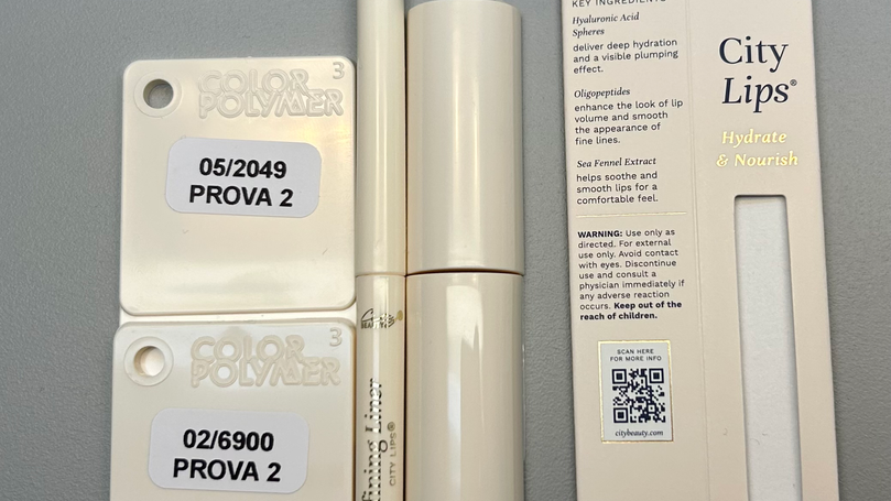
Created color inconsistencies in gold components (green/orange cast issues)
-
Felt outdated vs. modern prestige competitors
-
Provided limited storytelling + weak claims visibility
The legacy system relied almost entirely on one dark blue shade, causing all products to blend together. The midnight blue — a valuable brand equity — was being overused, leading to poor navigation, limited shelf impact, and a dated aesthetic misaligned with premium competitors.
02
The Challenge
Redesign and premiumize the entire packaging system while:
-
Retaining our signature midnight blue as a recognizable brand anchor
-
Keeping packaging costs equal or lower
-
Improving brand recognition and navigation at shelf
-
Creating a scalable, future-proof system for new categories
-
Supporting compliance and retail merchandising requirements
Internal friction existed over cost perception — stakeholders feared an elevated look would increase COGS.


We conducted a competitive packaging audit — analyzing material finishes, color systems, structural forms, brand hierarchy, and retail presence. Our goal was to identify how premium beauty brands communicate trust, clinical efficacy, and luxury at shelf — and where City Beauty needed to evolve to compete.
Alongside design, we modeled cost scenarios to maintain or improve margin. By removing metallized caps, simplifying wall construction, and shifting to matte finishes, we uncovered meaningful savings — while exploring elevated material alternatives to preserve a luxe feel without exceeding budget.
03
Insights & Evaluations
Minimalist design and softer tones increase perceived value and trust — directly influencing purchase behavior at shelf and strengthening our competitive position in prestige retail.
Consumer Preference
-
Research showed women in our target demo (30–60): Prefer softer neutrals + monochromatic looks
-
Perceive minimalist design as more premium + trustworthy
-
Are more likely to purchase based on packaging that stands out at retail
Competitive Audit
-
Brands in our price tier (Estee Lauder, Fresh, Clinique, Tatcha, Caudalie) → Use category-coded colors + clearer hierarchy + luxe finishes.
We needed our packaging to look like it belonged on the same shelf.
Internal Packaging Issues
-
Multiple cap vendors → poor consistency + QC issues
-
Double wall primary → unnecessary cost in some categories
-
Soft-touch coatings → expensive but not adding enough perceived value
-
A smarter material strategy could save up to 31% per unit on certain SKUs

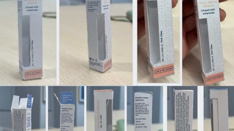
To validate structure, readability, and shelf impact, I led the creation of full-scale physical mockups. These prototypes enabled stakeholder alignment and rapid decision-making on hierarchy, finishes, and form.

We analyzed color perception for women 45+ — uncovering a preference for soft, low-saturation tones that feel premium and approachable. This informed a new modular palette system optimized for product categorization and retail navigation.

Previous packaging relied heavily on a dark navy tone — making it difficult to distinguish shade, formula type, or benefit at shelf. We transitioned to a refined neutral base with a shade-revealing window, improving shopability and communicating makeup-skincare hybrid positioning.
04
Strategy
Strategic Objectives
-
Premiumize the brand without raising cost
-
Strengthen shopability through a line-navigation system
-
Create a retail-ready visual system for future shelf presence
Key Decisions & Strategies
-
Introduce a clinical-luxe, monochromatic palette
-
Vanilla for makeup, harbor blue for treatments, midnight blue for night products, cove blue for essentials, pink/peach for supplements, etc.
-
-
Standardize substrate + finish choices
-
Eliminate wasteful variations and reduce QC issues
-
-
Add design elements that increase impact at 0 cost
-
QR codes linking to PDP for trust-building
-
“Science-Backed Research + Visible Results” credibility seal
-
Exploring creative solutions and ideas by utilizing all space on the unit carton and screenprint
-
-
Create a scalable architecture
-
New products snap easily into system — faster launches
-
05
Execution
Line Differentiation Visuals
-
Not only is the color differentiation help customers navigate benefits and product type, it helps the internal team navigate packaging design decisions so that we hold ourselves to a great standard of consistency.

Packaging Hierarchy Redesign
-
Stronger storytelling on panels
-
Clear claims placement + action-oriented copy
Cost-Optimized Engineering
-
Removal of soft-touch on SKUs, removal of gold caps across all products (Except lip gloss), competitive component sourcingSingle-wall packaging where acceptable by category
06
Results & Impact
-
Improved packaging consistency + perceived premium value with zero COGS increase
-
Design system strengthened retail pitch readiness (Macy’s, Walgreens, Old Navy, interest continuation)
-
Reduced vendor errors + fewer revisions → faster production cycles
-
Enabled future category expansion with plug-and-play design rules
-
Concept validated by CEO + Ops leadership for rollout plan


