City Beauty® Brand Messaging & Social System
Building a behavior-driven content system that transforms social from product-led to narrative-led.
Key Role: Director, Product & Design
Timeline: Current
Collaboration: Senior Graphic Designer - Emma Chisholm
Deliverables: brand messaging pillars, social launch & sale planning, brand storytelling

Project Overview
City Beauty had strong products and a loyal customer base, but its social presence lacked cohesion and emotional depth.
I led the development of a unified messaging and content system — grounded in how our 45+ customer actually thinks, shops, and engages with skincare.
01
The Challenge
The issue wasn’t a lack of content — it was a lack of connection between content and customer behavior.
-
Content was brand-led, not customer-behavior-led
-
Over-indexed on product promotion
-
Didn’t reflect how women 45+ actually discover and evaluate products

City Beauty's instagram feed is promotional & product heavy — lacks storytelling.
02
My Role
Led internal brand audit and messaging development in collaboration with leadership and external partners.
-
Defined brand philosophy, pillars, and messaging system
-
Audited social performance and content gaps
-
Developed content pillars and storytelling framework
-
Translated brand strategy into actionable social formats
03
Strategic Insight
Our customer doesn’t engage with content as “skincare marketing.”
She engages with it as part of her daily lifestyle and environment.
Social content needed to feel like something she naturally encounters — not something being sold to her.
04
Strategic Shift

04
The System
I built a content system designed around how content is consumed — not just
what is communicated.
3 Content Modes
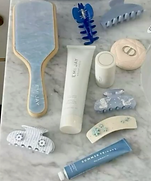
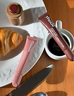
01 Environmental Content
Content that blends into her natural scrolling behavior
-
Coffee routines
-
Bathroom vanity moments
-
Morning / night rituals
-
Subtle product integration
02 Relatable Reality Content
Content that reflects real experiences of aging skin
-
Fine lines
-
Puffiness
-
Skin changes over time
-
Honest, non-polished visuals
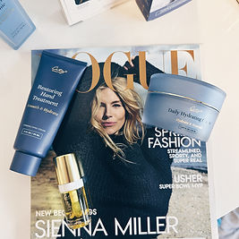
03 Product Proof Content
Content that validates performance
-
Before & after
-
Texture shots
-
Demonstrations
-
Ingredient credibility
05
Visual Direction


Designed to feel elevated, real, and integrated into her world — not overly branded or clinical.
Primary Visual Anchors
-
Soft neutrals (vanilla, cream, beige)
-
Natural lighting
-
Real-life environments (bathroom, vanity, kitchen)
-
A touch of our navy blue
Secondary Visual Anchors
-
Texture close-ups
-
Skin detail shots
-
Subtle luxury materials
06
Messaging Framework
To maintain consistency, I aligned content to three messaging pillars:
-
Beauty That Works → Results, proof
-
Refined by Time → Mature confidence
-
Revealed Through Care → Ritual + lifestyle
07
Content Examples
The system translates into repeatable, scalable formats:
-
Morning routine (environmental)
-
“This is why your concealer creases” (relatable hook)
-
Before/after transformations (proof)
-
Subtle product-in-use moments

08
Impact
Shifted social strategy from product-driven to behavior-driven — creating a more natural, engaging experience for the target audience.
Established a scalable content system that aligns brand messaging with real customer behavior.
Built a foundation for improved engagement, stronger storytelling, and long-term brand equity.
By designing for how our customer actually engages with content, we created a system that feels less like marketing — and more like part of her everyday life.